The 11 Best Kajabi Website Examples for Inspiration (2026 Guide)

Thinking about building a website for your online business but need some inspiration from other successful Kajabi website examples?
It’s no secret that I love Kajabi. After using the program for several years, I’ve come to really appreciate its capacity to create more than just online courses and digital products. It’s also really a versatile platform for building websites that aren’t just visually striking but also optimized for engagement and conversion. In fact, nearly 100,000 websites have been built with Kajabi.
In addition to using Kajabi myself on a regular basis, I’ve also come across numerous businesses across different sectors utilizing its tools to construct websites that truly resonate with their audience. These sites are great examples of Kajabi’s capabilities in integrating marketing and design, resulting in a seamless user experience that drives both traffic and conversions.
Read on for a look at some fantastic websites built using Kajabi so you can see what’s possible when building your site on this platform.
Table of Contents
Kajabi Website Example #1: Sonia Roselli
This website is all about makeup and learning more about what beauty products to use and how to use them, to help every person look the way they want. It handles everything from casual makeup at home to exquisite bridal makeup and can be a good starting point for anyone looking to learn more about makeup.
It uses Kajabi to promote its videos and blogs and to sell its products through its e-commerce store. It also offers content like business training for bridal makeup artists for its paid members.
This website does a great job leveraging Kajabi to provide a comprehensive platform for educating anyone interested in makeup and at the same time and using its e-commerce capabilities to sell products through its store.

Kajabi Website Example #2: Pain Cure Clinic

Pain Cure Clinic is a website designed to share information about curing Tension Myositis Syndrome (TMS). Started by John and Laura Thornton, this website is a classic example of how Kajabi can be used to build a simple, informative, and visually appealing page.
It uses Kajabi to promote its videos and blogs as well as to sell products through its e-commerce store.
One cool feature of this site is the fast-loading video testimonials that enhance user engagement without compromising page performance
Kajabi Website Example #3: Floret Online Workshop

This platform provides the content and courses you need to grow your flower garden or even build a flower-based business. Erin Benzakien, a leading American florist and the brainchild behind the Floret Online Workshop, uses this website to provide step-by-step instruction on growing flowers. In essence, she shares her knowledge and experience with the world for other flower growers to pursue their passion and become successful if they want to explore commercial options.
Built on Kajabi, this platform generates leads for her online workshop and at the same time, boosts conversion by enthusing visitors to learn the art of growing flowers. It also uses Kajabi’s e-commerce features to sell books and to provide information for visitors to make informed decisions about joining the workshops.
Kajabi Website Example #4: The Bromley Method

On this website, Emma Bromley hosts live sessions, offers workshops and courses, and even helps to schedule private sessions for pilates. The combination of these different services into a single platform clearly shows the versatility of Kajabi. The overall website is simple and effective in conveying what it should. Every image shows how women can get back in shape after pregnancy and handle their postpartum stress.
It also allows potential customers to book an in-person session with Emma at her private studio in Woodland Hills
This ability to provide many options for customers and the seamless integration of all these services into a single platform is the highlight of this website.
Kajabi Website Example #5: Earn That Body

Earnthatbody.com is an online nutrition and fitness streaming service that offers live streaming strength training sessions, besides a slew of other courses related to fitness. As a visitor, you can watch live classes or sign up for specific courses that start and end on specified days. Plus, you can also sign up for a strong body challenge program that is ongoing and motivates you to take care of your health and nutrition.
Created using Kajabi’s builder, this site has an intuitive menu that takes you to three athlete programs, seven nutritional programs, and many exercise modules. Customers can also purchase paid content like audiobooks through its e-commerce store. Besides all this, one-on-one consultations are offered as well.
Kajabi Website Example #6: Juice Guru Institute

This website provides the information and training you need to become a certified juice therapist. It is a fairly simple site with direct navigation options through the header menu. The “Success stories” tab doubles up as the portfolio page and is a smart marketing tactic by the creators. The “Freebies” menu is another catchy option that kindles the visitors’ curiosity to explore.
I chose to include this site because it has a number of unique aspects. You can watch a miniature video on the right-hand side while browsing the site. There’s also a social pop-up that shows who has bought a course from which part of the world. It also has podcasts and blogs along with an e-commerce store for books and juice equipment such as blenders and dehydrators. The Open House video can also be watched anytime.
Despite the heavy use of videos throughout the website, there’s no discernible variation in the performance of the web pages
Kajabi Website Example #7: Wholetones
Wholetones is a site that offers peaceful and spiritual music for healing. It is a unique platform that sells music to potential customers.
This website shows how you can leverage the power of Kajabi to combine audio and visuals for your audience. It also doubles up as a lead generation site to get more subscribers for your business. It has simple navigation with only the login option at the top. As you can see in the image below, it’s easy to offer discounts and coupons to bring more people on board.
Likewise, you can watch a trailer to get an idea of the offering or have a free trial, all of which are implemented using Kajabi’s tools.

Kajabi Website Example #8: ICY Productions
ICY Productions offers a wide range of content through its pages. It’s one of the few sites that makes the most of all of Kajabi’s capabilities. It offers two courses, gives away offers for early-bird purchases, has an interesting blog with relevant content and Call-to-Action (CTA) on each, and has an e-commerce store as well. This site also focuses more on content and has only a few visuals. The theme and color combination also blend well.
As a registered user of this site, you can have your library and move the watched/interested content to it. This backend storage/database activities are also handled by Kajabi. Besides the combination of different offerings add to this website’s appeal.

Kajabi Website Example #9: MPS Grants

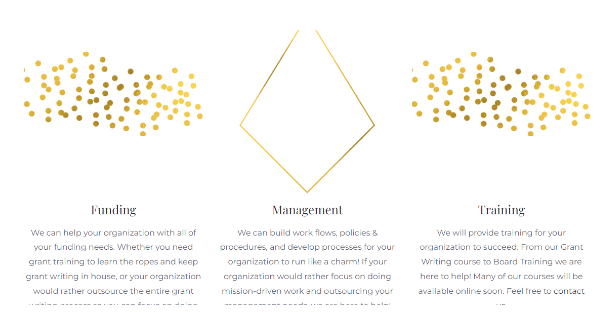
MPS Grants is a consultation and grant writing company that specializes in helping public organizations to get funding from philanthropic trusts and individuals. A highlight of this website is its simple design with little images. There is really a ton of content on these pages and they talk extensively about what this company can do for any organization that’s looking for additional funding. Yet, the pages look pleasing and uncluttered, and it’s easy to follow the flow. There’s even a section that offers premium content for paid members, and this is likely to have tips and tricks on securing the funding and other pertinent information. It also features a store where you can purchase relevant books and other materials. This site has a separate blogs section as well.
Kajabi Website Example #10: Love and Logic
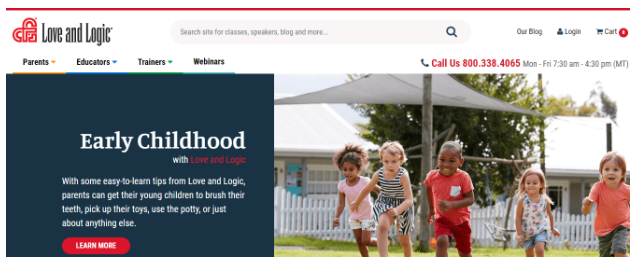
Love and Logic is a classic Kajabi-based website that offers a slew of courses related to children, parenting, and their overall well-being. A highlight of this site is the search capabilities on the homepage that enable you to filter courses based on class name, speaker, and more. It has a login page, that is mandatory to access courses, and this paywall was implemented with Kajabi’s tools as well. Further, the email marketing campaigns are also implemented and managed through Kajabi.
Other than pre-fixed courses, this website also hosts webinars at regular intervals for interested parents. The clean design and simple color combination add to the site’s appeal.

Kajabi Website Example #11: The Fight Back
This website has an intriguing name, and is all about material arts and exercise programs designed for women. As soon as you open the page, you can see that it is for both course creators and students who wish to take up martial arts to improve their well-being. There’s a separate course for anyone looking to teach martial arts to others and the highlights of this course are well-explained.
Also, the site displays the list of available programs, both in-person and online. It also has a podcast page and a list of podcasts that you can listen to. Lastly, there’s an online store that sells tiger-imprinted goodies as a symbol of fighting back, which by the way, is the theme of the entire website.
Overall, it’s a simple and clean-looking website that effectively conveys what it’s designed for.
A Final Word on Kajabi Website Examples
I am excited about the sheer creativity and smart design each of these Kajabi sites presents. Each has its own style and purpose, showcasing different features of the powerful platform.
These sites are proof of how Kajabi can take your online business to new heights. It’s not just about looking good, it’s about creating a space that resonates with your audience and turns your passion into profit.
Observing what others have achieved with Kajabi underscores that this platform is a powerhouse for sharing knowledge effectively.
If you are uncertain about building your site with Kajabi, I hope these examples provide inspiration. I can’t wait to see what you’ll create!
Want to learn more about Kajabi? Check out our full Kajabi review for an in-depth look at the platform. Thinking about signing up? Review our complete Kajabi Pricing Guide first to make the best choice.
Click here to try Kajabi for free today.
Have any other Kajabi website examples you love? Share them with us by commenting below.
Related Kajabi Resources
This post may contain affiliate links and we may earn commissions. Learn more in our disclosure.


